EduCast: Hierarchical Forecasting for University Enrollment
View on GitHub
This project started as my Bachelor's thesis back in 2023, where I used decision trees and random forests to predict course enrollment at my university (EPSEM-UPC). For my Master's thesis I took the idea much further: I wanted to see if modelling individual student trajectories with sequential models could actually beat the simple baselines that administrators already use, and whether hierarchical reconciliation could make forecasts consistent across different levels of academic planning.
The work also led to an academic paper currently under review:
Paper under review

Anass Anhari Talib
 Universitat Politecnica de Catalunya, Spain
Cristian Rodriguez Rivero
 Fontys University of Applied Sciences, The Netherlands
Christoph Bergmeir
 University of Granada, Spain
Larisa Survilo
 Riga Technical University, Latvia
Why enrollment forecasting matters
Universities need to decide how many instructors, classrooms, lab slots and teaching assistants to assign for each course before students have actually registered. Get it wrong and you end up with overcrowded classrooms or wasted budget on sessions nobody attends.
The usual approach is that programme coordinators look at last year's numbers and adjust based on experience. This works fine when things are stable, but breaks down when curricula change, cohort sizes shift, or courses get renamed or reorganized.
Most existing methods treat this as an aggregate time-series problem: take the enrollment count per course over the years and extrapolate. The problem is that course demand is really the sum of individual student decisions, and aggregate models ignore how each student moves through the curriculum.
The dataset
The data comes from EPSEM-UPC (Escola Politecnica Superior d'Enginyeria de Manresa), covering one engineering programme over 11 academic years.
| Property | Value |
|---|---|
| Students | 505 |
| Courses | 51 (49 with enrollments) |
| Enrollment records | 11,928 |
| Period | 2010 to 2021 |
| Terms per year | 2 (autumn, spring) |
| Total terms | 23 |
| Missing grades | 155 (1.3%) |
| Pass rate | ~70% |
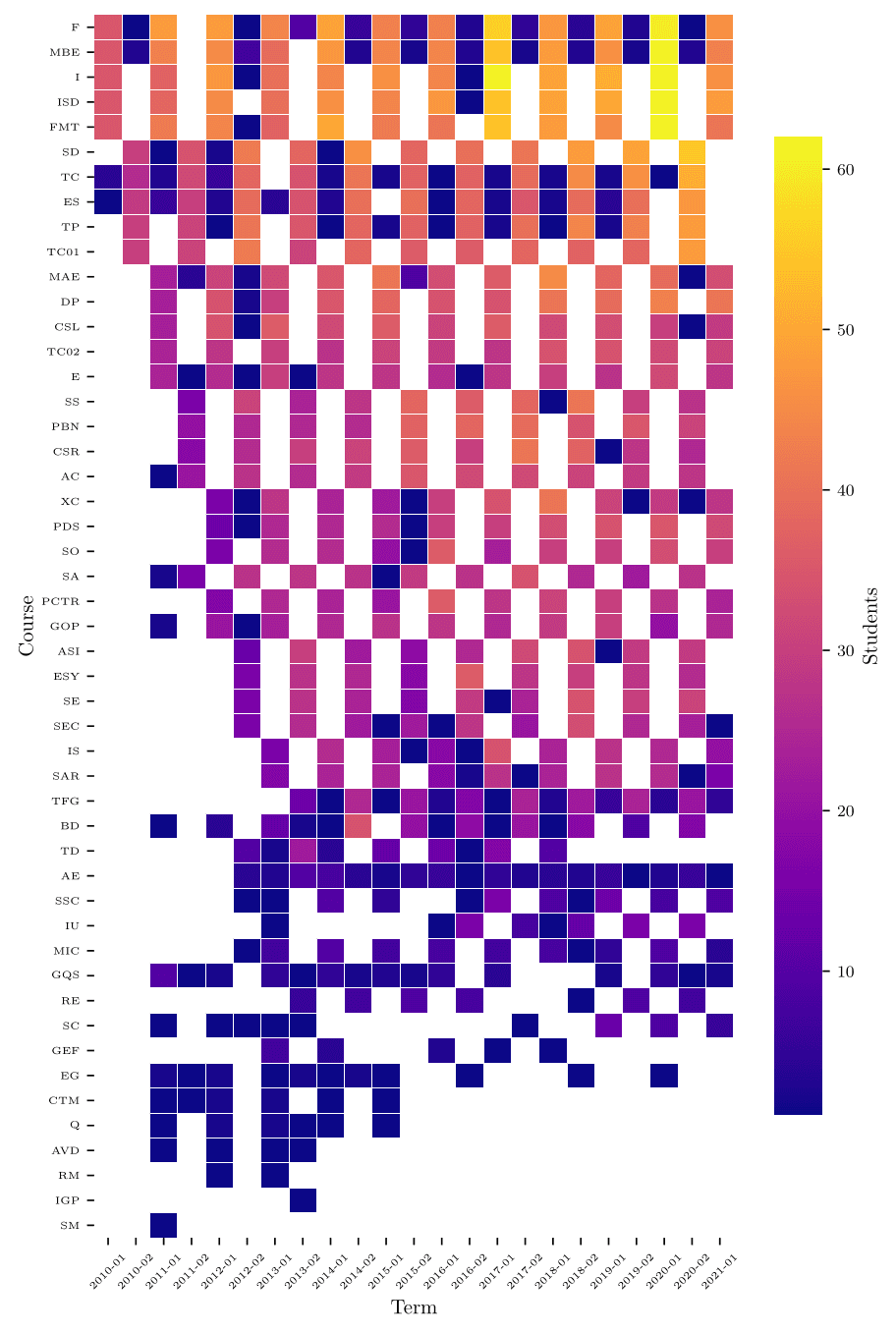
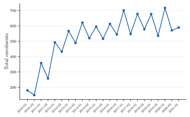
The heatmap below shows how enrollment is distributed across courses and terms. First-year compulsory subjects (top rows) consistently attract 40 to 60+ students, while advanced electives at the bottom have much smaller and more variable enrollment.
Feature engineering: the 154-dimensional student vector
The core idea is to represent each student's academic state at any given term as a single vector that captures everything relevant about their history. For each student and term , we build:
where:
- is the enrollment sub-vector: which courses the student is taking this term
- is the grade sub-vector: normalized grades for taken courses, as a sentinel for courses not taken (since 0 is a valid grade)
- is the attempts sub-vector: cumulative number of prior attempts per course, capped at 5
- is the cumulative grade point average up to term
This gives us dimensions. The full student history becomes a sequence that we feed into sequential models using sliding windows of 3 consecutive terms, producing input tensors of shape .
Micro vs Macro: two levels of modelling
We compared two fundamentally different forecasting strategies:
Micro models work at the student level. They predict the probability that each individual student will enroll in each course next term, then sum those probabilities across all continuing students to get a course-level count:
where is the set of continuing students and is the predicted enrollment probability for student in course .
Macro models work directly with aggregate enrollment counts per course, treating the problem as a traditional time-series forecasting task.
The key advantage of the Micro approach in our setting is the number of training samples. The Macro model only has 15 training windows (aggregate observations), while the Micro approach generates 1,322 student-level training samples from the same data. When your time series is short, having 88x more training examples makes a real difference.
Models compared
| Model | Level | Input | Loss |
|---|---|---|---|
| Naive lag-2 | Course | Prior-year count | - |
| Micro LSTM/GRU | Student | sequence | BCE |
| LightGBM | Student | Flattened | log loss |
| Course2Vec MLP | Student | Flat + embeddings | BCE |
| Macro LSTM | Aggregate | sequence | MSE |
The Naive lag-2 baseline is deliberately simple: it copies each course's enrollment from the same semester of the previous year. This is essentially what most administrators already do.
The Micro LSTM projects each 154-dimensional student-term vector to 64 dimensions, encodes a 3-term sequence with one LSTM layer of 128 hidden units, and maps the final state through dense layers to 51 sigmoid probabilities.
LightGBM flattens the 3-term sliding window into 462 tabular features. Gradient-boosted trees often work surprisingly well on tabular data even without explicit temporal modelling.
Course2Vec MLP adds learned course embeddings (trained on pre-test enrollment sequences using the Skip-gram approach from Word2Vec) to the flattened features. These embeddings capture co-enrollment patterns and curricular proximity.
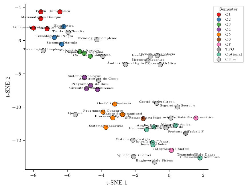
The t-SNE plot above shows how the learned course embeddings organize themselves. First-semester courses (red) cluster together at the top, later semesters fan out, and electives scatter around the edges. The model learned curriculum structure without being told about it.
Training
All models were trained on 2010 to 2017 and tested on 2018 to 2021 using a strict chronological split to avoid temporal leakage. Hyperparameters were kept intentionally low-capacity to avoid overfitting on this small dataset: one recurrent layer, 128 hidden units, dropout 0.2, learning rate 0.001, batch size 64 for the Micro LSTM.
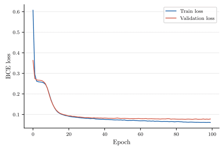
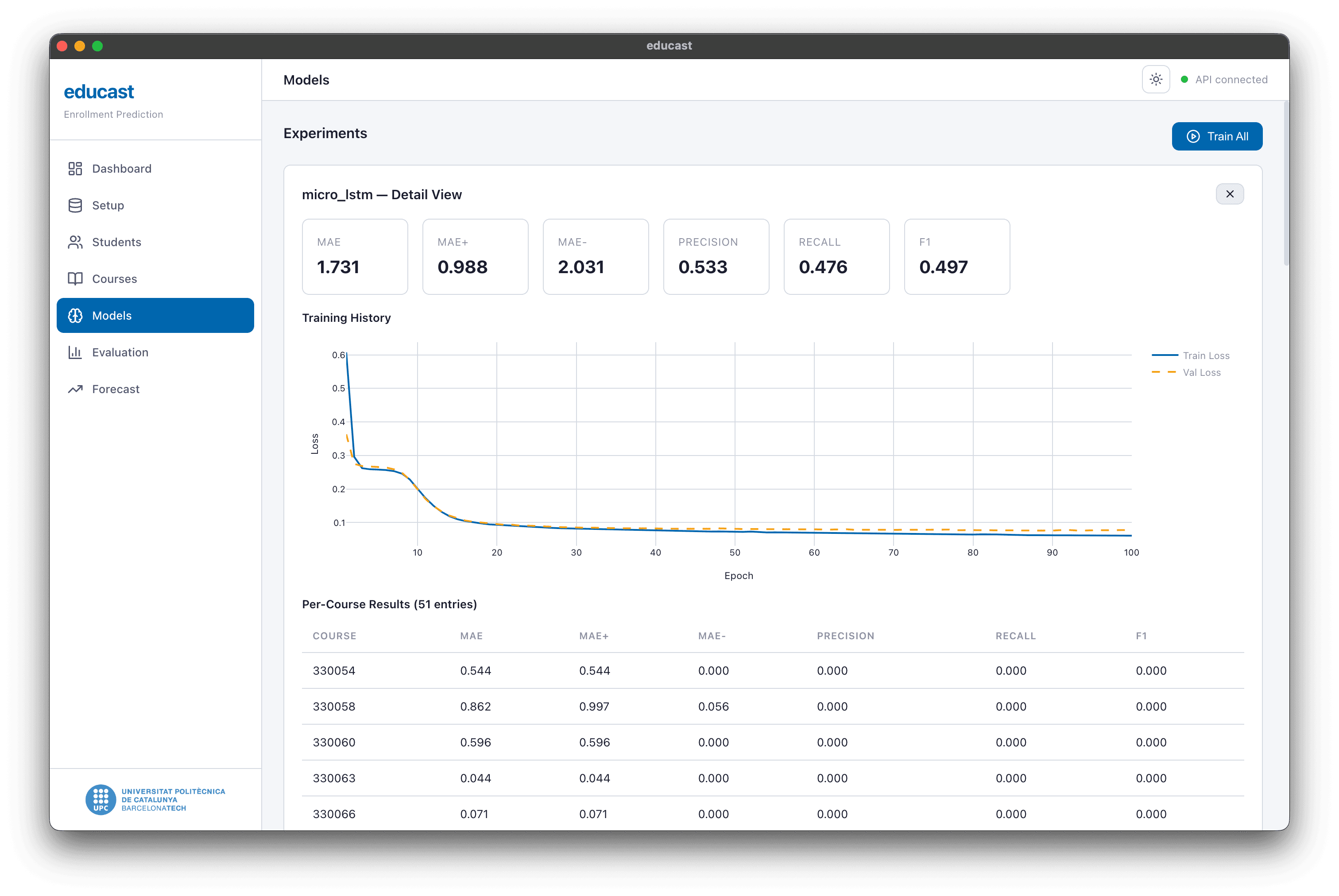
The training curves show healthy convergence with minimal overfitting: the validation loss closely tracks the training loss throughout.
Results
Forecasting accuracy (MAE)
The main metric is Mean Absolute Error in students per course, measured on the chronological test set (2018 to 2021):
| Model | MAE |
|---|---|
| Per-course reconciliation (oracle) | 1.43 |
| LightGBM, student-level | 1.68 |
| Naive lag-2 baseline | 1.69 |
| Micro LSTM | 1.73 |
| Course2Vec MLP | 1.78 |
| Macro LSTM | 5.57 |
The three best practical methods (LightGBM, Naive, Micro LSTM) are all very close, forecasting within roughly two students per course on average. The Macro LSTM performs much worse because it only has 15 training windows to learn from.
An interesting takeaway: the seasonal Naive baseline is genuinely hard to beat on this dataset. Year-over-year enrollment at this school is fairly stable, and the signal that individual trajectory models can capture is modest when the baseline is already that strong.
Actual vs Predicted heatmap
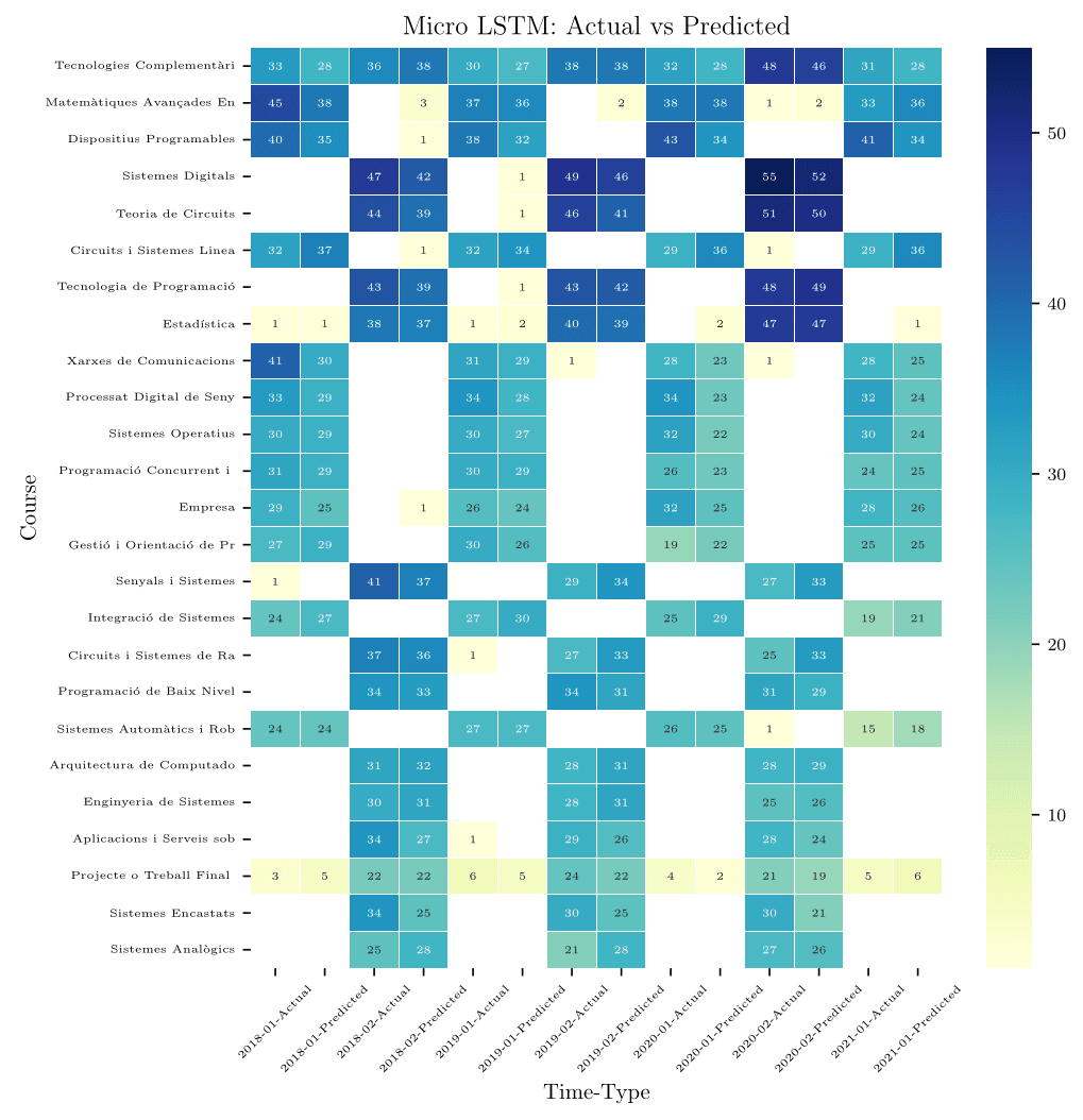
The Micro LSTM predictions (right columns of each pair) closely track actual values for most courses. The largest errors tend to occur on courses with sudden enrollment spikes or drops that the model hasn't seen before.
Ablation study
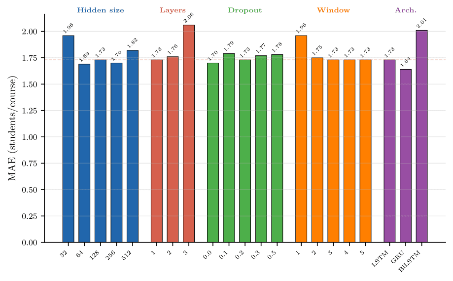
The ablation study reveals several things about what works in this small-data regime:
- Architecture matters more than tuning. The GRU achieves the lowest MAE at 1.64, outperforming the LSTM (1.73) and especially the BiLSTM (2.01). Simpler gated architectures work better when data is limited.
- Adding capacity hurts. Going from 1 to 3 layers increases MAE from 1.73 to 2.06. Hidden sizes of 64 to 256 are all similar, but 32 is too small (1.96) and 512 starts overfitting (1.82).
- Window size is not critical. Windows of 2 to 5 terms all give similar results around 1.73, but a window of 1 term is clearly worse (1.96).
Classification perspective
When evaluated as a per-student binary classification problem (will this student enroll in this course?), the tree-based models achieve reasonable F1 scores:
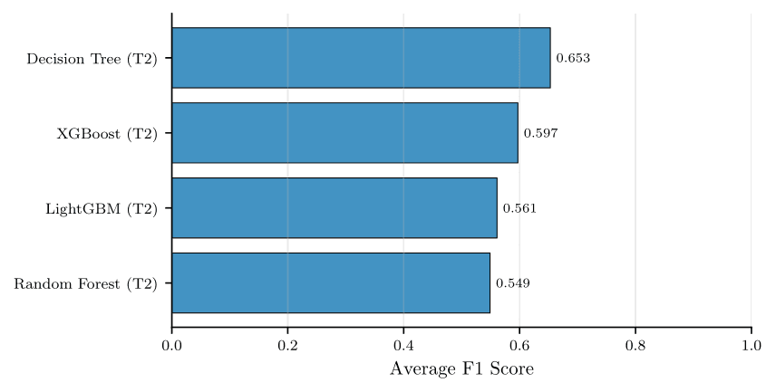
Decision trees at depth 4 achieve the best average F1 (0.653), outperforming XGBoost (0.597), LightGBM (0.561) and Random Forest (0.549). The F1 scores are moderate because sparse electives have very few positive examples, making them inherently hard to classify.
The classification results use a random train/test split and F1 metric, while the forecasting results use a chronological split and MAE. These two evaluation setups answer different questions and the metrics should not be compared directly.
Hierarchical reconciliation
What is hierarchical reconciliation?
In academic planning, forecasts need to be consistent across different levels. Individual student enrollments sum up to per-course counts, which sum up to programme totals, which sum up to the institution total. If you forecast at each level independently, the numbers usually don't add up.
Hierarchical reconciliation adjusts independently generated forecasts so that they are coherent across the hierarchy. The idea is to combine base forecasts from multiple levels (student-level Micro and aggregate Macro) and find a reconciled forecast that is consistent.
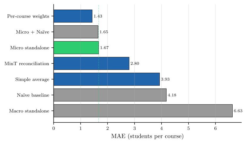
We tested five reconciliation strategies:
- Global weighted blend: weighted combination of Micro and Macro forecasts
- Simple average: equal-weight average
- MinT reconciliation: minimum-trace reconciliation that minimizes forecast variance
- Micro + Naive blend: combining student-level model with the seasonal baseline
- Per-course weights: oracle that selects the best model per course on the test set (upper bound, not deployable)
The reconciliation paradox
The results show something important: reconciliation does not automatically help. When the aggregate base forecasts are poor (Macro LSTM at 5.57 MAE), mixing them with good student-level forecasts only makes things worse. MinT reconciliation degrades to 2.80, and simple averaging reaches 3.93.
The only combination that slightly improves over Micro standalone (1.67) is Micro + Naive at 1.65. Per-course weights achieve 1.43 but this is an oracle result, selected on the test set, and not a deployable strategy.
The takeaway is that reconciliation requires base forecasts at multiple levels that are individually informative. When one level is much weaker than the other, it contaminates rather than improves the final result.
The EduCast tool
As part of this project I built EduCast, an interactive web application that wraps the entire pipeline: data loading, model training, evaluation, and forecasting. It's designed so that programme coordinators can use it without needing to write code.
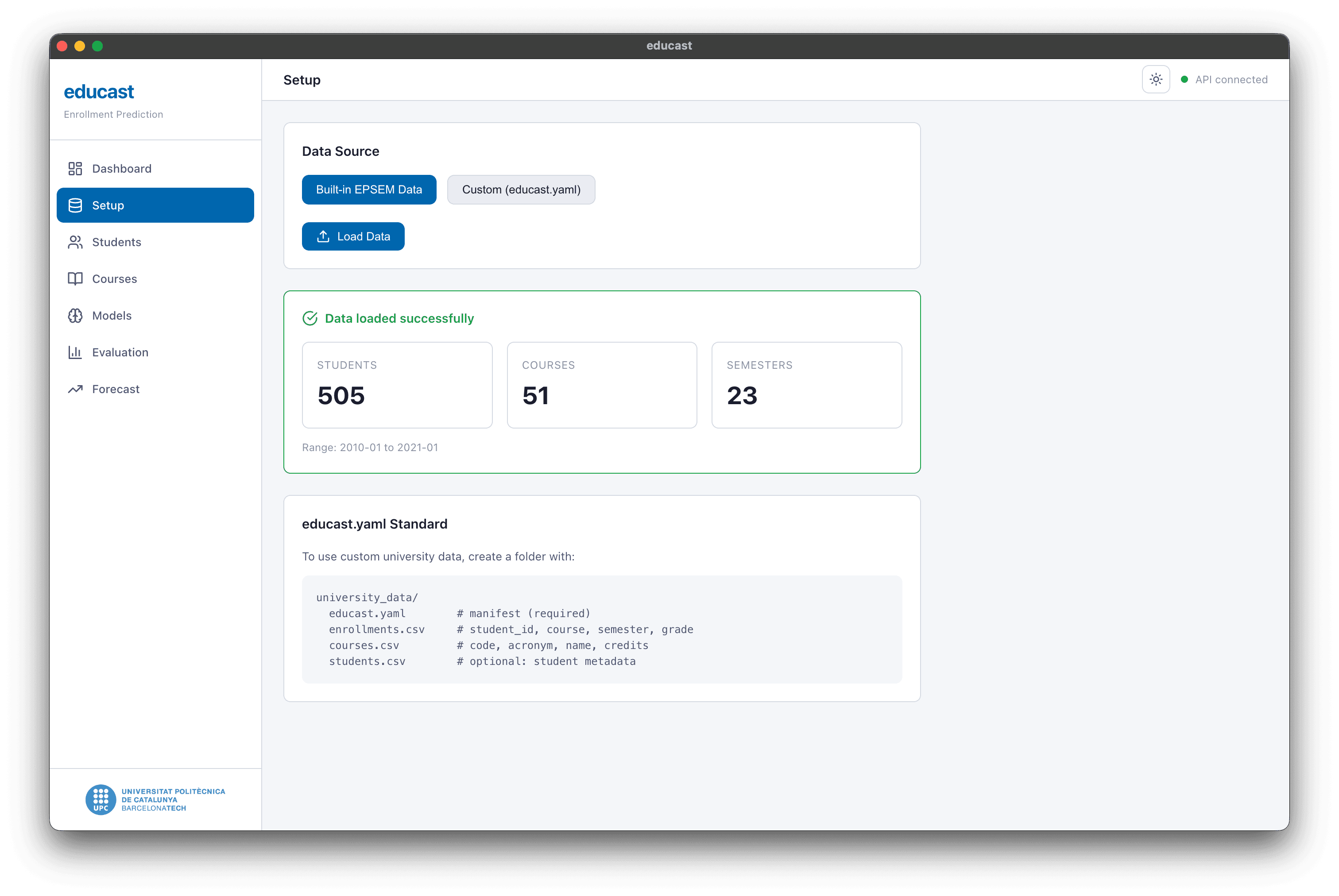
The app supports a standardized data format (*.educast.json) that I designed to handle enrollment data from different universities with different term structures, grading scales, and optional clickstream data.
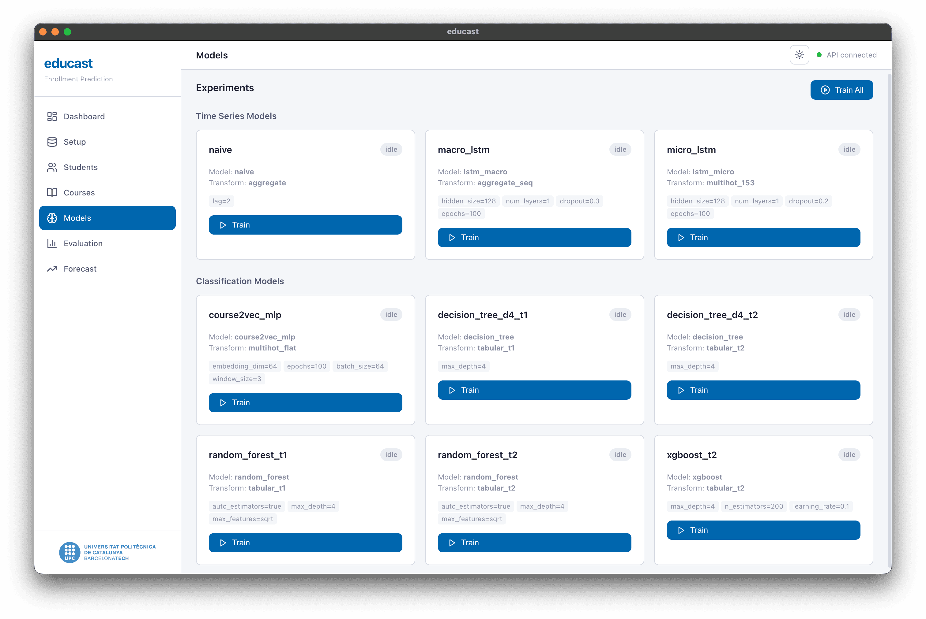
The models page lets you configure and train all the models from a single interface. Each model card shows its type, transform, and hyperparameters, with a button to start training.
Multi-university data collection (what didn't work)
The original plan was to collect enrollment data from multiple European universities and build a cross-institutional forecasting system. We obtained data from Riga Technical University (Latvia) and Vilnius Gediminas Technical University (Lithuania), but three problems prevented us from using it:
- Platform migrations. Both institutions had recently migrated their systems. The exported data was a patchwork of old and new formats with renamed, restructured, or missing fields.
- Course-code inconsistency. The same course appeared under multiple codes across years, and different courses sometimes shared codes after migrations. We spent considerable time building course-code mappings through co-enrollment graph analysis but couldn't validate them reliably enough.
- Unstructured exports. The default Moodle log exports contained large volumes of unrelated records, no schema documentation, and duplicated entries.
This experience taught me that cross-institutional forecasting is a data-harmonization problem before it's a modelling problem. Any future multi-university study needs to invest heavily in standardized data formats and stable course identifiers before modelling can begin.
Key takeaways
- Student-level modelling works, but seasonal baselines are strong. The Micro LSTM (1.73 MAE) and LightGBM (1.68 MAE) are competitive with a simple Naive baseline (1.69 MAE). All three forecast within about two students per course.
- More data points matter more than model complexity. The Micro approach generates 88x more training samples than the Macro approach from the same dataset. This sample advantage is what makes student-level modelling viable in small institutional settings.
- GRU > LSTM > BiLSTM in this regime. Simpler gated architectures generalize better when the dataset is small. Adding layers or capacity leads to overfitting.
- Reconciliation only helps when base forecasts are individually good. Mixing a strong Micro forecast with a weak Macro forecast makes things worse.
- Real-world educational data is messy. Course-code instability, platform migrations, and inconsistent identifiers are the biggest practical obstacles.